Making amazing compositions with similar color tones
Game of Thrones by Lu Dongbiao
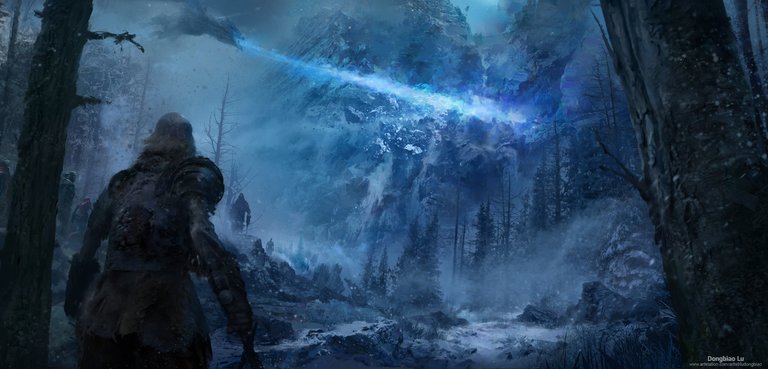
Many times I've tried this. At first, I failed every time. When trying to use the same color or similar color tones to make a detailed painting, it's important to play with the levels of saturation. Excellent shadowing is also very important, together with points of brightness. The only way that elements can be identified in paintings, as I mentioned a few days ago is by making the eye notice the contrast between the thing and the surroundings.
Even though the tones are very similar, the left side is pushed out of the focus by making it much less saturated. Notice that the left and right sides are gray. The center side is bluer, and the elements surrounding the fire are more detailed and sharper.
You would assume that only the warrior, the dragon and the fire and stones are very detailed. However, notice that the pine trees and the rocks to the right of the warrior have a lot of detail as well, though mostly on the tips as they are bunched up and hidden by the fog, stones and other trees.
There is a lot to learn on this painting about how to make elements contrast without hard color differences, and about how to make a painting seem very detailed when many parts are only silhouettes and are hidden behind blurry elements such as fog.
Congratulations @reksnek! You have completed the following achievement on the Steem blockchain and have been rewarded with new badge(s) :
You can view your badges on your Steem Board and compare to others on the Steem Ranking
If you no longer want to receive notifications, reply to this comment with the word
STOPTo support your work, I also upvoted your post!
Vote for @Steemitboard as a witness to get one more award and increased upvotes!
Congratulations @reksnek!
Your post was mentioned in the Steem Hit Parade for newcomers in the following category: