Personal Improvement of Logo in STEEMZANG to Make the Platform More Beautiful | 个人对【STEEMZZANG】Logo的改良,让平台更加美化
01
Today is July 1. I'm glad that STEEMZANG will be able to launch steem block chain in advance on June 30. I'm glad that steem has added a new force.
今天是7月1日,很高兴【STEEMZZANG】能够于6月30日提前上线steem区块链,很高兴steem又增加了一份新的力量。

For STEEMZAANG social networking platform, the overall use is OK, there is no Bug, otherwise, the platform will be like sports platform, messy into a pot of porridge.
对于【STEEMZAANG】社交平台,在使用方面来说总体还算可以,没有出现什么Bug,不然的话,这个平台也会像体育平台那样,乱成一锅粥。
02
[STEEMZANG], the only thing I don't like is the logo of this platform. To be honest, the logo of the platform is really not very good looking...
【STEEMZZANG】,我唯一不喜欢的就是这个平台的Logo。说真的,平台的Logo真的不是很好看... ...
Because of this, I personally designed logo for STEEMZANG. Because it was not clear what the main color of the platform was, it was designed with gradient colors for Logo decoration.
因为这个事,我也亲自为【STEEMZZANG】设计过Logo。当初因为不清楚这个平台的主色是什么,所以在设计的时候采用了渐变色为Logo进行了装饰。
Below is the logo I designed earlier, which was praised on Discord's "zzan" channel and I'm glad to be recognized. But the previous logo was too dynamic.
以下是我之前设计的Logo,在Discord的【zzan】频道内被称赞,我很高兴被认可。不过之前的Logo太有活力了。
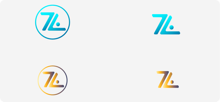
It wasn't until STEEMZANG came online that I knew what their main color was and what kind of logo was better for the platform.
直到【STEEMZZANG】上线之后我才知道了他们的主色是什么,什么样的Logo更适合这个平台。
03
At present, the logo of the platform seems rough, and gives people a serious feeling, not easy relatives. So I want to improve the logo of the current platform, and improve it on the basis of the logo of the current platform and the logo I designed before.
目前平台的Logo看上粗显得有些粗糙,而且给人的感觉很严肃,不怎么轻松亲人。所以我希望改良一下目前平台的Logo,在现在平台Logo的基础上和我之前设计的Logo的基础上进行改良。
This removes the seriousness and makes steem users more receptive to the platform and its logo.
以此去除这种严肃性,从而让steem用户更容易接受这个平台,以及平台的Logo。
So here's the logo I designed on the basis of the original logo.
那么以下是我在原来的基础上设计的Logo。

This design uses rounded corners in a wide range. Rounded corners can make Logo more acceptable to the public, because rounded corners are very humanistic and can avoid harming the audience physically and mentally, which is beyond the reach of sharp corners design.
这次的设计大范围地采用了圆角,圆角地设计可以让Logo更容易被大众接受,因为圆角设计非常具有人性化,可以避免对受众者身心造成一定的伤害,这是尖角设计无法达到的。
This is the first version of "STEEM" and "ZZANG" are separated, which makes Logo more orderly and spatial.
以上这个是第一个版本,“STEEM”和“ZZANG”分开了,这样更能让Logo具有一定的条理性和空间性。
Then there's the second version. The only difference between the design here and the first version is that "STEEM" and "ZZANG" are not separated, but together. Of course, this also shows that [STEEMZANG] is a social platform based on steem block chain.
然后接下来是第二个版本,这里的设计唯一与第一个版本不同的是“STEEM”和“ZZANG”并没有分开,而是挨在一起的。当然这也说明了,【STEEMZZANG】是一个基于steem区块链的社交平台。
04
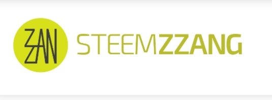
Now this is the logo of STEEMZANG. I can't accept it very much. I don't like the seriousness. A social platform should be more relaxed, and this seriousness is contrary to the nature of social platform.
现在这个是【STEEMZZANG】目前的Logo,我是不太能接受这个Logo的,我不太喜欢这种严肃感。一个社交平台,更应该是轻松自在的,而这种严肃感恰巧与社交平台的本质相违背。
I don't know if the zzan team will accept my current design, but of course I hope they will.
我不知道zzan团队是否会接受我现在的这种设计,当然我希望他们能够接受。

你今天过的开心吗?新人吗?《steemit指南》拿一份吧,以免迷路; 另外一定要去 @team-cn 的新手村看看,超级热闹的大家庭。假如我的留言打扰到你,请回复“取消”。
老铁牛逼,给你点个赞,虽然不是很值钱 :D
没关系,没关系,我也给你点。
谢谢老铁😁
Posted using Partiko Android
設計師啊! 真牛! 我也點點 😁
Posted using Partiko iOS
谢谢啊!低调低调
Posted using Partiko Android
阿兰神作出来了,快去叫zzan改logo
Posted using Partiko Android
他们能改我要笑醒
Posted using Partiko Android
感谢阿兰给ZZAN设计的新logo,会转发给官方进行评价。
让我猜一下你是谁,猜对可以给我满赞吗?猜错我给你满赞。
您是阿盐
!shop
猜错了
Posted using Partiko Android
你好鸭,zzan.co17!
@hertz300给您叫了一份外卖!
由 @hertz300 小Q 在晴空万里 开着汽车 给您送来
花生阿姨牌花生
吃饱了吗?跟我猜拳吧! 石头,剪刀,布~
如果您对我的服务满意,请不要吝啬您的点赞~
@onepagex
好的。感谢
Posted using Partiko Android
搞设计就是牛逼!
哪里哪里
Posted using Partiko Android
Lovely logo, I like the one in which ZZANG is not seperated from the STEEM.
Thank you
Posted using Partiko Android
Pleasure is all mine. Wish you a lovely day.
Thank you
Posted using Partiko Android
我是来抱大腿的!!!
Posted using Partiko Android
😏
Posted using Partiko Android
!shop
Posted using Partiko Android
你好鸭,阿兰!
@julian2013赠送1枚SHOP币给你!
目前你总共有: 23枚SHOP币
查看或者交易
无聊吗?跟我猜拳吧! **石头,剪刀,布~**SHOP币请到 steem-engine.com.石头
Posted using Partiko Android
It’s a tie! 平局!再来!下回我再出拳头!
布
Posted using Partiko Android
It’s a tie! 平局!再来!在猜拳界,我还没有输过!
石头
Posted using Partiko Android
You win!!!! 你赢了!
So this is sports-based?